이 글에서 만드는 것
시맨틱 HTML과 반응형 CSS를 연결해 소개·카드·이미지·비교표·문의 입력·FAQ가 있는 가상 서비스 페이지를 완성하고, 좁은 화면과 키보드 동작을 함께 확인합니다.
1. 한 페이지에 모아도 역할을 먼저 나눕니다
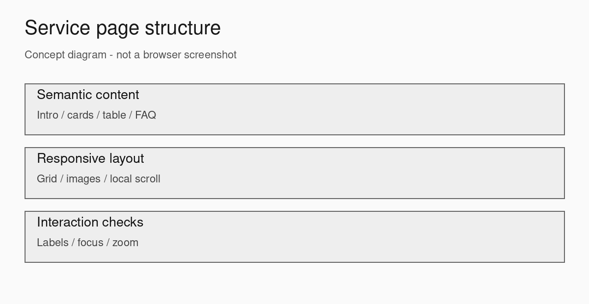
앞에서 배운 요소를 하나씩 사용할 때는 쉬워 보여도 한 화면에 모으면 폭·여백·초점·제목 계층이 서로 영향을 줍니다. 이번 목표는 가상 공부 공간의 안내 페이지를 완성하고, 각 요소가 좁은 화면과 키보드에서도 연결되는지 확인하는 것입니다. 페이지는 소개 → 공간 카드 → 요금표 → 문의 입력 → FAQ 순서입니다. JavaScript나 서버 구현은 필요하지 않습니다.
먼저 시맨틱 문서와 폼, 반응형 카드, details FAQ를 복습하면 코드를 나누어 읽기 좋습니다.
2. 파일 구조와 실행 방법
ZIP의 starter와 complete 각각에 index.html, style.css, assets/room-plan.png가 들어 있습니다. PNG는 실습을 위해 직접 만든 960×540 회색 평면도이며 외부 이미지 요청이 없습니다. HTML을 복사해서 새 폴더에서 실행한다면 ZIP의 assets 폴더도 함께 복사하세요. HTML의 상대 경로는 그 HTML 파일이 있는 위치를 기준으로 해석됩니다.
index.html을 직접 열어도 됩니다. 로컬 서버를 쓰려면 ZIP을 푼 폴더에서 아래 명령을 실행한 뒤 http://127.0.0.1:8000/complete/를 여세요. 서버를 종료하려면 터미널에서 Ctrl+C를 누릅니다.
python -m http.server 8000 --bind 127.0.0.13. 한 열부터 시작하고 필요한 곳에만 열을 늘립니다
좁은 화면에서는 소개와 이미지, 카드가 모두 한 열입니다. 48rem 이상에서 소개는 두 열, 카드는 세 열로 바뀝니다. minmax(0, 1fr)는 열 내부 내용이 길어도 열의 최소 크기가 과도하게 커지지 않도록 돕습니다. 모든 곳에 고정 폭을 주거나 페이지 전체를 축소하지 않습니다. 표는 열 비교가 중요하므로 스크롤 영역에서 형태를 유지합니다.
다음은 레이아웃 변화만 발췌한 부분 코드입니다. 실행할 전체 CSS는 글 끝에 있습니다.
.cards { display: grid; gap: 1rem; }
@media (min-width: 48rem) {
  .cards { grid-template-columns: repeat(3, minmax(0, 1fr)); }
}
4. 이미지의 비율과 설명을 함께 확인합니다
width와 height는 원본 비율 960:540을 전달하고, max-width: 100%와 height: auto는 화면 안에서 비율을 유지합니다. 그림에는 책상 하나와 의자 네 개라는 정보가 있으므로 alt에 그 내용을 적었습니다. figcaption은 이 그림이 실제 영업장의 사진이 아닌 가상 배치도임을 설명합니다. 이미지 파일명이 맞아도 assets 폴더 위치가 다르면 깨질 수 있습니다.
5. 문의 폼은 입력과 초기화까지만 구현합니다
이 실습에는 제출 버튼이 없습니다. 버튼은 type=”reset”이며 입력을 전송하거나 성공 안내를 띄우지 않습니다. 텍스트와 이메일 입력이 함께 있는 정적 폼에서 Enter를 누르는 것을 서버 전송 실습으로 사용하지 않습니다. 실제 개인정보는 입력하지 마세요. 제출·유효성 검사·저장·예약을 완성한 화면이라고 설명하면 안 됩니다.
label의 for와 입력 id를 연결하고, 관심 공간은 fieldset과 legend로 묶습니다. name=”space”는 라디오 버튼을 하나의 선택 그룹으로 만듭니다. 폼의 안내는 aria-describedby로 연결합니다. 이메일 입력 형식이 type=”email”인 것과 실제 메일이 전송되는 것은 별개입니다. 폼 제출 동작은 앞의 폼 기초 실습에서 별도로 익힙니다.
6. 이동과 FAQ도 기본 요소로 연결합니다
메뉴 링크는 section의 id로 이동합니다. 첫 Tab에는 본문으로 건너뛰기 링크가 나타납니다. 본문에 tabindex=”-1″을 둔 것은 이동 대상으로 초점을 받을 수 있게 하려는 것이며 일반 Tab 순서에 항목을 더하지 않습니다. FAQ는 details와 summary를 사용하므로 별도의 클릭 스크립트가 필요하지 않습니다. summary는 버튼을 새로 넣지 않고 그대로 사용합니다.
7. starter에서 수행할 순서
- 한 열 starter를 열고 메뉴 링크와 초기화 버튼부터 조작합니다.
- 소개 문장과 figure를 .intro로 묶은 뒤 미디어 쿼리로 두 열을 만듭니다.
- 세 번째 카드를 추가하고 카드 높이를 고정하지 않은 상태에서 긴 문장을 넣어 봅니다.
- caption과 scope가 있는 요금표를 추가하고 표의 바깥 영역에만 가로 스크롤을 만듭니다.
- 레이블이 있는 문의 내용, 라디오 그룹, details FAQ를 추가합니다.
- 320px·768px·1280px에서 확인하고 Tab 순서, FAQ 조작, 입력 초기화를 각각 기록합니다.
8. 문제가 생겼을 때 확인할 곳
- 이미지가 늘어나면 CSS의 고정 height를 찾고 원본 width/height 비율과 height: auto를 확인합니다.
- 카드가 작은 화면을 밀면 grid의 열 수와 고정 너비를 확인합니다. 긴 단어가 있는 실제 콘텐츠도 별도로 넣어 보세요.
- 요금표 때문에 전체 화면이 가로로 움직이면 .table-scroll 밖 요소의 폭을 확인합니다. 표 행을 block으로 바꾸는 우회는 하지 않습니다.
- 초기화가 “빈 화면”이 아니라 첫 라디오 선택으로 돌아오는 것은 기본값 복원 동작입니다. checked가 초기 상태를 정합니다.
- FAQ 제목이 Tab으로 선택되지 않으면 summary가 details의 첫 자식인지, 기본 요소를 다른 div로 바꾸지 않았는지 봅니다.
9. 완료 기준과 다음 연습
각 제목이 내용을 설명하고, 이미지가 찌그러지지 않고, 표의 마지막 열에 접근되고, 모든 링크와 FAQ 및 폼 입력을 키보드로 사용할 수 있어야 합니다. 브라우저 화면에서 확인한 항목과 화면 읽기 프로그램으로 별도 확인한 항목은 나누어 기록하세요. 이 예제만으로 접근성 적합성을 보장하지 않습니다.
추가 과제는 카드 하나와 FAQ 하나를 더하는 것입니다. 메뉴를 늘릴 때는 작은 화면에서 자연스럽게 줄이 바뀌는지 확인합니다. 네 번째 카드를 추가하면 마지막 줄이 생기는 것이 정상입니다. 완성 코드와 똑같은 그림을 만드는 것보다 콘텐츠가 늘 때도 의미와 조작이 유지되는지 설명하는 것이 목표입니다.
완성 코드: complete/index.html 전체
아래 코드는 부분 예제가 아니라 HTML 파일 전체입니다. 같은 폴더에 이어지는 style.css를 저장하세요.
실습 파일
파일 경로를 확인하고 같은 프로젝트 안에 저장하세요. 이미지 등 소스 목록에 없는 파일과 실행 안내는 실습 ZIP에 포함되어 있습니다.
본문 영역과 문의 폼을 구성하고 화면 너비에 맞춰 서비스 페이지를 완성합니다. 수정 전은 시작 상태, 수정 후는 비교할 완성 상태입니다.
수정 전
index.html
<!doctype html>
<html lang="ko">
  <head>
    <meta charset="utf-8" />
    <meta name="viewport" content="width=device-width, initial-scale=1" />
    <title>
      HTML CSS 종합 실습: 소개·카드·이미지·요금표·문의 폼·FAQ가 있는 반응형 서비스
      페이지
    </title>
    <link rel="stylesheet" href="style.css" />
  </head>
  <body>
    <header class="site-header">
      <p>연습 공간 안내</p>
      <nav aria-label="주요 메뉴">
        <a href="#services">공간 안내</a> <a href="#inquiry">문의 연습</a>
      </nav>
    </header>
    <main>
      <h1>함께 공부하는 공간</h1>
      <p>운영 정보는 가상입니다. starter에서는 한 열 구조를 먼저 확인합니다.</p>
      <figure>
        <img
          src="assets/room-plan.png"
          width="960"
          height="540"
          alt="책상 하나와 의자 네 개가 배치된 가상 방"
        />
        <figcaption>가상 공간 배치 예시</figcaption>
      </figure>
      <section id="services">
        <h2>공간 안내</h2>
        <div class="cards">
          <article class="card">
            <h3>개인 공부</h3>
            <p>자료를 읽고 연습합니다.</p>
          </article>
          <article class="card">
            <h3>팀 프로젝트</h3>
            <p>함께 작업합니다.</p>
          </article>
        </div>
      </section>
      <!-- TODO: 이미지와 소개를 묶고 넓은 화면에서 두 열로 배치하세요. -->
      <!-- TODO: 요금 비교표와 details FAQ를 추가하세요. -->
      <section id="inquiry">
        <h2>문의 입력 연습</h2>
        <p>전송·저장 기능이 없습니다. 가상 값만 입력하세요.</p>
        <form>
          <label for="nickname">가상 닉네임</label
          ><input id="nickname" type="text" /><label for="email">가상 이메일</label
          ><input id="email" type="email" /><button type="reset">연습 값 초기화</button>
        </form>
      </section>
    </main>
  </body>
</html>
style.css
* {
  box-sizing: border-box;
}
html {
  color: #222;
  background: #f1f1f1;
  font-family: system-ui, sans-serif;
}
body {
  margin: 0;
  line-height: 1.7;
}
input {
  accent-color: #555;
}
main,
.site-header,
.site-footer {
  width: min(70rem, 100%);
  margin-inline: auto;
  padding: 1.5rem;
}
h1,
h2,
h3,
p {
  margin-top: 0;
}
a {
  color: #222;
  text-underline-offset: 0.2em;
}
:focus-visible {
  outline: 3px solid #111;
  outline-offset: 3px;
}
section {
  margin-block: 2rem;
}
.notice {
  padding: 1rem;
  background: #e5e5e5;
  border: 1px solid #666;
}
img {
  display: block;
  max-width: 100%;
  height: auto;
}
figure {
  margin: 0;
}
.card {
  padding: 1rem;
  border: 1px solid #777;
  margin-block: 1rem;
}
form input,
form label {
  display: block;
  max-width: 100%;
}
수정 방법
index.html
index.html에서 아래 차이가 있는 위치를 수정하세요. -는 삭제할 줄, +는 추가할 줄이며 표시는 실제 코드에 넣지 않습니다.
본문 영역과 문의 폼을 구성하고 화면 너비에 맞춰 서비스 페이지를 완성합니다.
--- 수정 전/index.html
+++ 수정 후/index.html
@@ -10,48 +10,160 @@
     <link rel="stylesheet" href="style.css" />
   </head>
   <body>
+    <a class="skip-link" href="#main">본문으로 건너뛰기</a>
     <header class="site-header">
-      <p>연습 공간 안내</p>
+      <p><strong>연습 공간 안내</strong></p>
       <nav aria-label="주요 메뉴">
-        <a href="#services">공간 안내</a> <a href="#inquiry">문의 연습</a>
+        <a href="#services">공간 안내</a> <a href="#prices">요금</a>
+        <a href="#inquiry">문의 연습</a> <a href="#faq">자주 묻는 질문</a>
       </nav>
     </header>
-    <main>
-      <h1>함께 공부하는 공간</h1>
-      <p>운영 정보는 가상입니다. starter에서는 한 열 구조를 먼저 확인합니다.</p>
-      <figure>
-        <img
-          src="assets/room-plan.png"
-          width="960"
-          height="540"
-          alt="책상 하나와 의자 네 개가 배치된 가상 방"
-        />
-        <figcaption>가상 공간 배치 예시</figcaption>
-      </figure>
-      <section id="services">
-        <h2>공간 안내</h2>
+    <main id="main" tabindex="-1">
+      <section class="intro" aria-labelledby="intro-title">
+        <div>
+          <p>HTML · CSS 종합 실습</p>
+          <h1 id="intro-title">함께 공부하는 공간을 소개합니다</h1>
+          <p>
+            작은 소개 영역부터 요금 비교와 문의 입력까지 한 페이지로 연결합니다. 모든
+            운영 정보와 가격은 연습용 가상 정보입니다.
+          </p>
+          <a href="#inquiry">문의 양식 살펴보기</a>
+        </div>
+        <figure>
+          <img
+            src="assets/room-plan.png"
+            width="960"
+            height="540"
+            alt="가운데 직사각형 책상 하나와 위아래 의자 네 개가 배치된 방의 평면 예시"
+          />
+          <figcaption>직접 제작한 가상 공간 배치 이미지입니다.</figcaption>
+        </figure>
+      </section>
+      <section id="services" aria-labelledby="services-title">
+        <h2 id="services-title">공간 안내</h2>
         <div class="cards">
           <article class="card">
             <h3>개인 공부</h3>
-            <p>자료를 읽고 연습합니다.</p>
+            <p>한 자리에서 자료를 읽고 연습합니다. 이용 조건을 먼저 확인하세요.</p>
           </article>
           <article class="card">
             <h3>팀 프로젝트</h3>
-            <p>함께 작업합니다.</p>
+            <p>네 명이 같은 책상을 사용합니다. 역할을 나누어 작업하기 좋습니다.</p>
+          </article>
+          <article class="card">
+            <h3>발표 연습</h3>
+            <p>
+              준비한 발표 흐름을 점검합니다. 예시 페이지에는 실제 예약 기능이 없습니다.
+            </p>
           </article>
         </div>
       </section>
-      <!-- TODO: 이미지와 소개를 묶고 넓은 화면에서 두 열로 배치하세요. -->
-      <!-- TODO: 요금 비교표와 details FAQ를 추가하세요. -->
-      <section id="inquiry">
-        <h2>문의 입력 연습</h2>
-        <p>전송·저장 기능이 없습니다. 가상 값만 입력하세요.</p>
-        <form>
-          <label for="nickname">가상 닉네임</label
-          ><input id="nickname" type="text" /><label for="email">가상 이메일</label
-          ><input id="email" type="email" /><button type="reset">연습 값 초기화</button>
+      <section id="prices" aria-labelledby="prices-title">
+        <h2 id="prices-title">요금 비교</h2>
+        <p id="price-help">
+          좁은 화면에서는 표 영역에 초점을 놓고 좌우 방향키로 이동할 수 있습니다.
+        </p>
+        <div
+          class="table-scroll"
+          role="region"
+          aria-labelledby="price-caption"
+          aria-describedby="price-help"
+          tabindex="0"
+        >
+          <table>
+            <caption id="price-caption">
+              가상 공간 1회 이용 조건
+            </caption>
+            <thead>
+              <tr>
+                <th scope="col">공간</th>
+                <th scope="col">시간</th>
+                <th scope="col">인원</th>
+                <th scope="col">가상 요금</th>
+              </tr>
+            </thead>
+            <tbody>
+              <tr>
+                <th scope="row">개인 공부</th>
+                <td>1시간</td>
+                <td>1명</td>
+                <td>10,000원</td>
+              </tr>
+              <tr>
+                <th scope="row">팀 프로젝트</th>
+                <td>2시간</td>
+                <td>4명</td>
+                <td>30,000원</td>
+              </tr>
+              <tr>
+                <th scope="row">발표 연습</th>
+                <td>2시간</td>
+                <td>4명</td>
+                <td>40,000원</td>
+              </tr>
+            </tbody>
+          </table>
+        </div>
+      </section>
+      <section id="inquiry" aria-labelledby="inquiry-title">
+        <h2 id="inquiry-title">문의 입력 연습</h2>
+        <p id="demo-note" class="notice">
+          입력과 초기화만 연습합니다. 전송·저장·예약 기능이 없습니다. 실제 개인정보 대신
+          가상의 값을 입력하세요.
+        </p>
+        <form aria-describedby="demo-note">
+          <div class="field">
+            <label for="nickname">가상 닉네임</label
+            ><input id="nickname" type="text" autocomplete="off" placeholder="연습생" />
+          </div>
+          <div class="field">
+            <label for="email">가상 이메일</label
+            ><input
+              id="email"
+              type="email"
+              autocomplete="off"
+              placeholder="practice@example.com"
+            />
+          </div>
+          <fieldset>
+            <legend>관심 공간</legend>
+            <label class="choice"
+              ><input type="radio" name="space" value="personal" checked /> 개인
+              공부</label
+            >
+            <label class="choice"
+              ><input type="radio" name="space" value="team" /> 팀 프로젝트</label
+            >
+          </fieldset>
+          <div class="field">
+            <label for="message">연습 문의 내용</label
+            ><textarea id="message" rows="4" aria-describedby="message-help"></textarea>
+            <p id="message-help">예: 팀 프로젝트 공간의 책상 크기가 궁금합니다.</p>
+          </div>
+          <button type="reset">연습 값 초기화</button>
+          <p>초기화하면 텍스트 입력은 비워지고 관심 공간은 처음 선택으로 돌아갑니다.</p>
         </form>
       </section>
+      <section id="faq" aria-labelledby="faq-title">
+        <h2 id="faq-title">자주 묻는 질문</h2>
+        <details>
+          <summary>이 페이지에서 예약할 수 있나요?</summary>
+          <p>
+            아니요. HTML과 CSS를 연습하는 가상 안내 페이지이며 예약 기능은 없습니다.
+          </p>
+        </details>
+        <details>
+          <summary>입력한 문의가 전송되나요?</summary>
+          <p>
+            전송되지 않습니다. 제출 버튼과 처리 서버가 없으며 입력·선택·초기화 동작만
+            제공합니다.
+          </p>
+        </details>
+      </section>
     </main>
+    <footer class="site-footer">
+      <p>웹 퍼블리싱 연습용 가상 서비스</p>
+      <a href="#main">본문 처음으로</a>
+    </footer>
   </body>
 </html>
수정 후 탭의 전체 파일과 비교한 뒤 본문의 확인 절차를 실행하세요.
style.css
style.css에서 아래 차이가 있는 위치를 수정하세요. -는 삭제할 줄, +는 추가할 줄이며 표시는 실제 코드에 넣지 않습니다.
본문 영역과 문의 폼을 구성하고 화면 너비에 맞춰 서비스 페이지를 완성합니다.
--- 수정 전/style.css
+++ 수정 후/style.css
@@ -42,21 +42,137 @@
   background: #e5e5e5;
   border: 1px solid #666;
 }
+.table-scroll {
+  max-width: 100%;
+  overflow-x: auto;
+  border: 1px solid #666;
+  padding: 0.5rem;
+}
+table {
+  width: 100%;
+  min-width: 36rem;
+  border-collapse: collapse;
+  background: #fff;
+}
+caption {
+  text-align: left;
+  font-weight: 700;
+  padding: 0.75rem;
+}
+th,
+td {
+  border: 1px solid #777;
+  padding: 0.75rem;
+  text-align: left;
+  vertical-align: top;
+}
+thead,
+tbody th {
+  background: #e5e5e5;
+}
+
+.skip-link {
+  position: absolute;
+  left: 1rem;
+  top: -8rem;
+  padding: 0.75rem;
+  background: #fff;
+  border: 2px solid #222;
+}
+.skip-link:focus {
+  position: fixed;
+  top: 1rem;
+  z-index: 10;
+}
+nav {
+  display: flex;
+  flex-wrap: wrap;
+  gap: 0.75rem 1.25rem;
+}
+.intro {
+  display: grid;
+  gap: 1.5rem;
+  align-items: center;
+}
+figure {
+  margin: 0;
+  min-width: 0;
+}
 img {
   display: block;
   max-width: 100%;
   height: auto;
 }
-figure {
-  margin: 0;
+figcaption {
+  font-size: 0.9rem;
+  margin-top: 0.5rem;
+}
+.cards {
+  display: grid;
+  gap: 1rem;
 }
 .card {
+  min-width: 0;
+  padding: 1.25rem;
+  background: #fff;
+  border: 1px solid #777;
+}
+form {
+  max-width: 42rem;
+}
+.field {
+  margin-block: 1rem;
+}
+.field label {
+  display: block;
+  font-weight: 700;
+}
+.field input,
+textarea {
+  width: 100%;
+  padding: 0.65rem;
+  font: inherit;
+  color: #222;
+  background: #fff;
+  border: 1px solid #666;
+}
+textarea {
+  resize: vertical;
+}
+fieldset {
+  min-width: 0;
+  padding: 1rem;
+  border: 1px solid #666;
+}
+.choice {
+  display: block;
+  padding-block: 0.35rem;
+}
+button {
+  padding: 0.65rem 1rem;
+  font: inherit;
+  color: #222;
+  background: #ddd;
+  border: 1px solid #555;
+}
+details {
+  margin-block: 0.75rem;
   padding: 1rem;
   border: 1px solid #777;
-  margin-block: 1rem;
+  background: #fff;
 }
-form input,
-form label {
-  display: block;
-  max-width: 100%;
+summary {
+  cursor: pointer;
+  font-weight: 700;
 }
+details p {
+  margin-block: 0.75rem 0;
+}
+@media (min-width: 48rem) {
+  .intro {
+    grid-template-columns: minmax(0, 1fr) minmax(0, 1fr);
+  }
+  .cards {
+    grid-template-columns: repeat(3, minmax(0, 1fr));
+  }
+}
수정 후 탭의 전체 파일과 비교한 뒤 본문의 확인 절차를 실행하세요.
수정 후
index.html
<!doctype html>
<html lang="ko">
  <head>
    <meta charset="utf-8" />
    <meta name="viewport" content="width=device-width, initial-scale=1" />
    <title>
      HTML CSS 종합 실습: 소개·카드·이미지·요금표·문의 폼·FAQ가 있는 반응형 서비스
      페이지
    </title>
    <link rel="stylesheet" href="style.css" />
  </head>
  <body>
    <a class="skip-link" href="#main">본문으로 건너뛰기</a>
    <header class="site-header">
      <p><strong>연습 공간 안내</strong></p>
      <nav aria-label="주요 메뉴">
        <a href="#services">공간 안내</a> <a href="#prices">요금</a>
        <a href="#inquiry">문의 연습</a> <a href="#faq">자주 묻는 질문</a>
      </nav>
    </header>
    <main id="main" tabindex="-1">
      <section class="intro" aria-labelledby="intro-title">
        <div>
          <p>HTML · CSS 종합 실습</p>
          <h1 id="intro-title">함께 공부하는 공간을 소개합니다</h1>
          <p>
            작은 소개 영역부터 요금 비교와 문의 입력까지 한 페이지로 연결합니다. 모든
            운영 정보와 가격은 연습용 가상 정보입니다.
          </p>
          <a href="#inquiry">문의 양식 살펴보기</a>
        </div>
        <figure>
          <img
            src="assets/room-plan.png"
            width="960"
            height="540"
            alt="가운데 직사각형 책상 하나와 위아래 의자 네 개가 배치된 방의 평면 예시"
          />
          <figcaption>직접 제작한 가상 공간 배치 이미지입니다.</figcaption>
        </figure>
      </section>
      <section id="services" aria-labelledby="services-title">
        <h2 id="services-title">공간 안내</h2>
        <div class="cards">
          <article class="card">
            <h3>개인 공부</h3>
            <p>한 자리에서 자료를 읽고 연습합니다. 이용 조건을 먼저 확인하세요.</p>
          </article>
          <article class="card">
            <h3>팀 프로젝트</h3>
            <p>네 명이 같은 책상을 사용합니다. 역할을 나누어 작업하기 좋습니다.</p>
          </article>
          <article class="card">
            <h3>발표 연습</h3>
            <p>
              준비한 발표 흐름을 점검합니다. 예시 페이지에는 실제 예약 기능이 없습니다.
            </p>
          </article>
        </div>
      </section>
      <section id="prices" aria-labelledby="prices-title">
        <h2 id="prices-title">요금 비교</h2>
        <p id="price-help">
          좁은 화면에서는 표 영역에 초점을 놓고 좌우 방향키로 이동할 수 있습니다.
        </p>
        <div
          class="table-scroll"
          role="region"
          aria-labelledby="price-caption"
          aria-describedby="price-help"
          tabindex="0"
        >
          <table>
            <caption id="price-caption">
              가상 공간 1회 이용 조건
            </caption>
            <thead>
              <tr>
                <th scope="col">공간</th>
                <th scope="col">시간</th>
                <th scope="col">인원</th>
                <th scope="col">가상 요금</th>
              </tr>
            </thead>
            <tbody>
              <tr>
                <th scope="row">개인 공부</th>
                <td>1시간</td>
                <td>1명</td>
                <td>10,000원</td>
              </tr>
              <tr>
                <th scope="row">팀 프로젝트</th>
                <td>2시간</td>
                <td>4명</td>
                <td>30,000원</td>
              </tr>
              <tr>
                <th scope="row">발표 연습</th>
                <td>2시간</td>
                <td>4명</td>
                <td>40,000원</td>
              </tr>
            </tbody>
          </table>
        </div>
      </section>
      <section id="inquiry" aria-labelledby="inquiry-title">
        <h2 id="inquiry-title">문의 입력 연습</h2>
        <p id="demo-note" class="notice">
          입력과 초기화만 연습합니다. 전송·저장·예약 기능이 없습니다. 실제 개인정보 대신
          가상의 값을 입력하세요.
        </p>
        <form aria-describedby="demo-note">
          <div class="field">
            <label for="nickname">가상 닉네임</label
            ><input id="nickname" type="text" autocomplete="off" placeholder="연습생" />
          </div>
          <div class="field">
            <label for="email">가상 이메일</label
            ><input
              id="email"
              type="email"
              autocomplete="off"
              placeholder="practice@example.com"
            />
          </div>
          <fieldset>
            <legend>관심 공간</legend>
            <label class="choice"
              ><input type="radio" name="space" value="personal" checked /> 개인
              공부</label
            >
            <label class="choice"
              ><input type="radio" name="space" value="team" /> 팀 프로젝트</label
            >
          </fieldset>
          <div class="field">
            <label for="message">연습 문의 내용</label
            ><textarea id="message" rows="4" aria-describedby="message-help"></textarea>
            <p id="message-help">예: 팀 프로젝트 공간의 책상 크기가 궁금합니다.</p>
          </div>
          <button type="reset">연습 값 초기화</button>
          <p>초기화하면 텍스트 입력은 비워지고 관심 공간은 처음 선택으로 돌아갑니다.</p>
        </form>
      </section>
      <section id="faq" aria-labelledby="faq-title">
        <h2 id="faq-title">자주 묻는 질문</h2>
        <details>
          <summary>이 페이지에서 예약할 수 있나요?</summary>
          <p>
            아니요. HTML과 CSS를 연습하는 가상 안내 페이지이며 예약 기능은 없습니다.
          </p>
        </details>
        <details>
          <summary>입력한 문의가 전송되나요?</summary>
          <p>
            전송되지 않습니다. 제출 버튼과 처리 서버가 없으며 입력·선택·초기화 동작만
            제공합니다.
          </p>
        </details>
      </section>
    </main>
    <footer class="site-footer">
      <p>웹 퍼블리싱 연습용 가상 서비스</p>
      <a href="#main">본문 처음으로</a>
    </footer>
  </body>
</html>
style.css
* {
  box-sizing: border-box;
}
html {
  color: #222;
  background: #f1f1f1;
  font-family: system-ui, sans-serif;
}
body {
  margin: 0;
  line-height: 1.7;
}
input {
  accent-color: #555;
}
main,
.site-header,
.site-footer {
  width: min(70rem, 100%);
  margin-inline: auto;
  padding: 1.5rem;
}
h1,
h2,
h3,
p {
  margin-top: 0;
}
a {
  color: #222;
  text-underline-offset: 0.2em;
}
:focus-visible {
  outline: 3px solid #111;
  outline-offset: 3px;
}
section {
  margin-block: 2rem;
}
.notice {
  padding: 1rem;
  background: #e5e5e5;
  border: 1px solid #666;
}
.table-scroll {
  max-width: 100%;
  overflow-x: auto;
  border: 1px solid #666;
  padding: 0.5rem;
}
table {
  width: 100%;
  min-width: 36rem;
  border-collapse: collapse;
  background: #fff;
}
caption {
  text-align: left;
  font-weight: 700;
  padding: 0.75rem;
}
th,
td {
  border: 1px solid #777;
  padding: 0.75rem;
  text-align: left;
  vertical-align: top;
}
thead,
tbody th {
  background: #e5e5e5;
}

.skip-link {
  position: absolute;
  left: 1rem;
  top: -8rem;
  padding: 0.75rem;
  background: #fff;
  border: 2px solid #222;
}
.skip-link:focus {
  position: fixed;
  top: 1rem;
  z-index: 10;
}
nav {
  display: flex;
  flex-wrap: wrap;
  gap: 0.75rem 1.25rem;
}
.intro {
  display: grid;
  gap: 1.5rem;
  align-items: center;
}
figure {
  margin: 0;
  min-width: 0;
}
img {
  display: block;
  max-width: 100%;
  height: auto;
}
figcaption {
  font-size: 0.9rem;
  margin-top: 0.5rem;
}
.cards {
  display: grid;
  gap: 1rem;
}
.card {
  min-width: 0;
  padding: 1.25rem;
  background: #fff;
  border: 1px solid #777;
}
form {
  max-width: 42rem;
}
.field {
  margin-block: 1rem;
}
.field label {
  display: block;
  font-weight: 700;
}
.field input,
textarea {
  width: 100%;
  padding: 0.65rem;
  font: inherit;
  color: #222;
  background: #fff;
  border: 1px solid #666;
}
textarea {
  resize: vertical;
}
fieldset {
  min-width: 0;
  padding: 1rem;
  border: 1px solid #666;
}
.choice {
  display: block;
  padding-block: 0.35rem;
}
button {
  padding: 0.65rem 1rem;
  font: inherit;
  color: #222;
  background: #ddd;
  border: 1px solid #555;
}
details {
  margin-block: 0.75rem;
  padding: 1rem;
  border: 1px solid #777;
  background: #fff;
}
summary {
  cursor: pointer;
  font-weight: 700;
}
details p {
  margin-block: 0.75rem 0;
}
@media (min-width: 48rem) {
  .intro {
    grid-template-columns: minmax(0, 1fr) minmax(0, 1fr);
  }
  .cards {
    grid-template-columns: repeat(3, minmax(0, 1fr));
  }
}
완성 코드: complete/style.css 전체
이 글이 도움이 되었나요?
웹 퍼블리싱 학습 순서
필수 13개 · 전체 15개
읽음 기록 관리
전체 과정 목차 (15개)
- 필수 학습 · HTML 입문: 시맨틱 문서와 접근 가능한 폼 만들기
- 필수 학습 · CSS 입문: 박스 모델·선택자·캐스케이드 직접 확인하기
- 필수 학습 · CSS Flex와 미디어 쿼리 입문: 반응형 카드 페이지 만들기
- 필수 학습 · CSS position 완전 이해: relative·absolute·fixed·sticky 실습
- 필수 학습 · HTML details와 summary로 접근 가능한 FAQ 만들기
- 필수 학습 · CSS Grid 실습: Flex 학습 카드로 열 맞추기와 auto-fit 비교
- 필수 학습 · CSS overflow 해결: 긴 텍스트·min-width: 0·말줄임 실습
- 필수 학습 · HTML 표 만들기: caption·scope로 비교표를 읽기 쉽게, 모바일에서는 표만 스크롤하기
- 필수 선수 · HTML CSS 이미지 문제 해결 실습: 경로·비율·잘림·흐림·CLS
- 필수 학습 · Container Query 실습: 같은 카드를 본문과 사이드바에 배치하기
- 선택 참고 · CSS Baseline 보는 법: 지원 범위와 폴백을 직접 확인하기
- 필수 학습 · CSS z-index가 안 먹힐 때: stacking context와 부모 층 디버깅
- 필수 선수 · 웹 접근성 기초 점검: 키보드 순서·초점 표시·확대 화면을 직접 확인하는 체크리스트
- 필수 학습 · HTML CSS 종합 실습: 소개·카드·이미지·요금표·문의 폼·FAQ가 있는 반응형 서비스 페이지 현재 글
- 선택 참고 · 프론트엔드 SEO 기초: HTML 구조와 이미지 성능 진단하기
새 글 받아보기
RSS 리더에서 BlogFlow의 새 글을 확인할 수 있습니다.
BlogFlow AI
이 글과 함께 공부하기
무엇을 도와드릴까요?
읽다가 막힌 부분을 물어보세요. 이 글을 바탕으로 설명하고, 이어서 읽을 본문을 연결합니다.